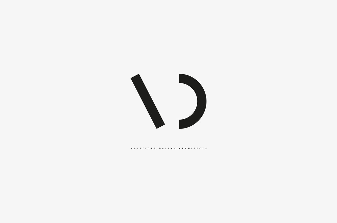
Aristides Dallas Architects
Branding / Typography
Branding / Typography
|
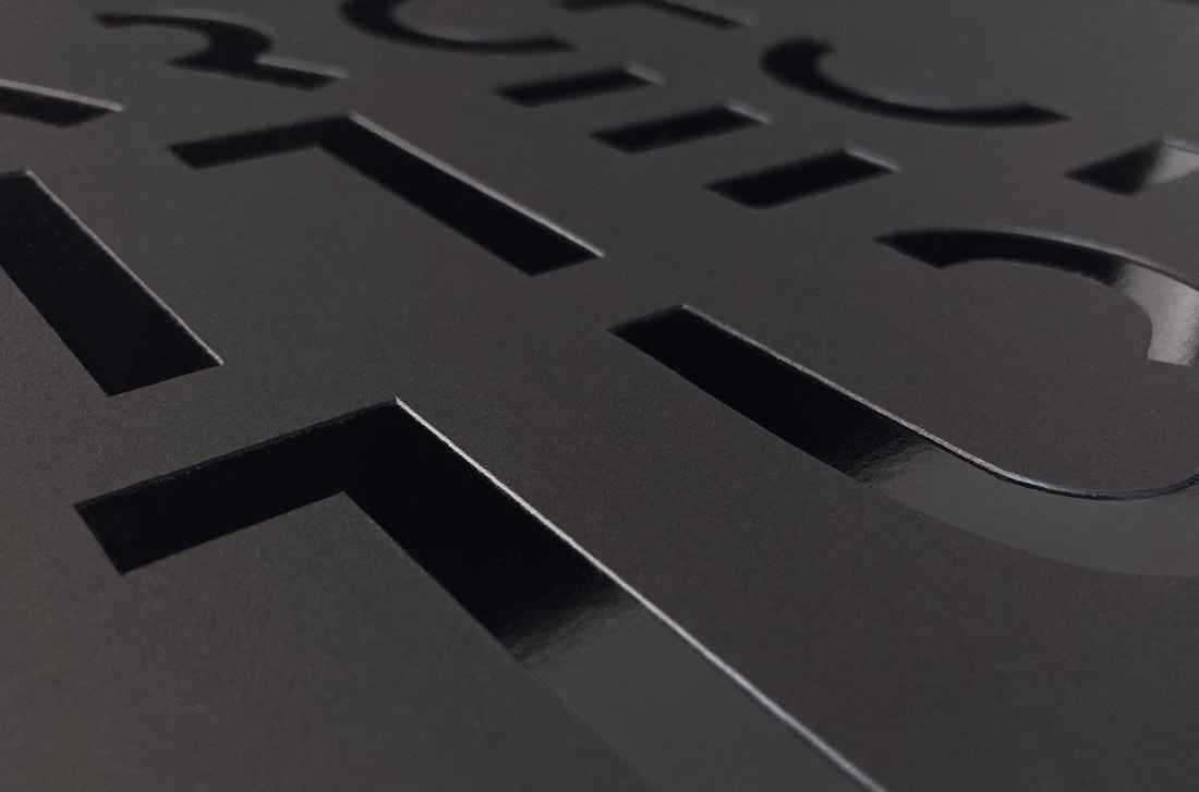
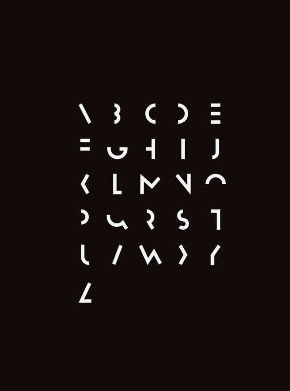
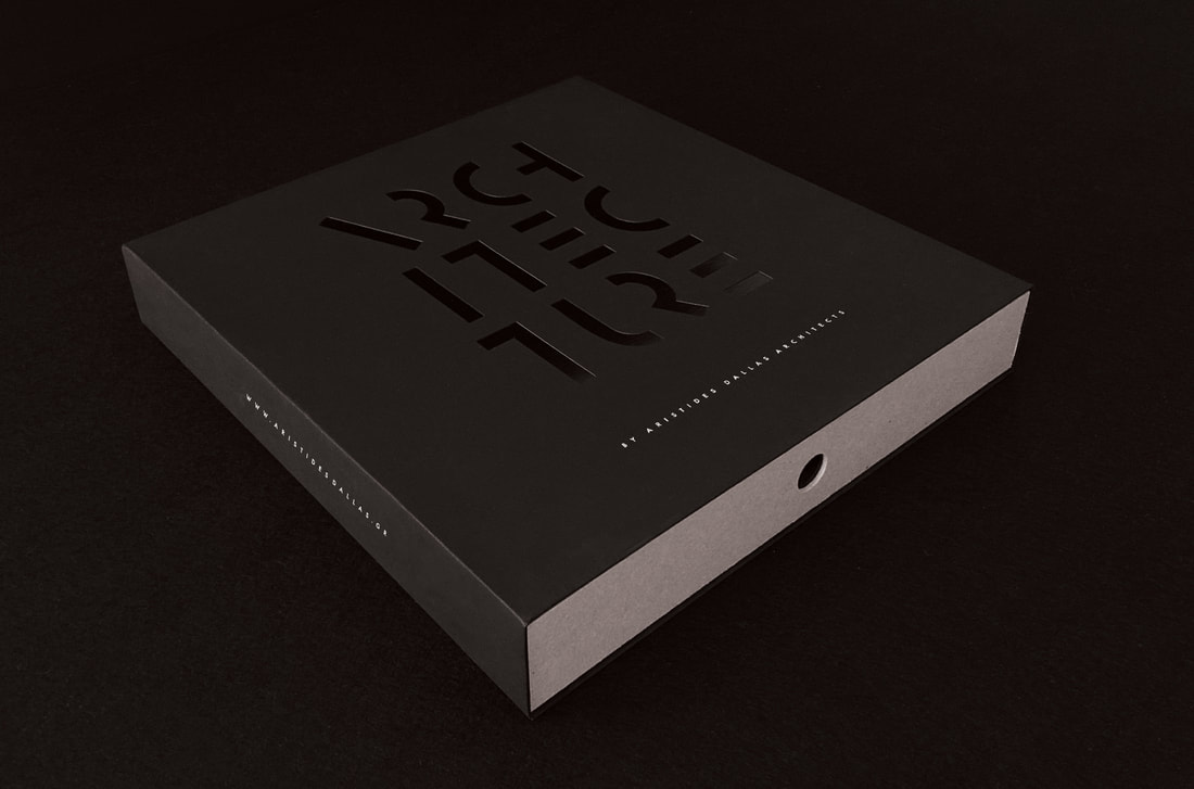
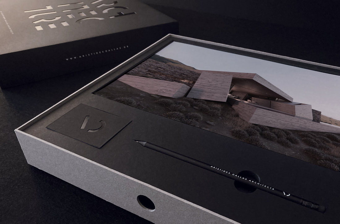
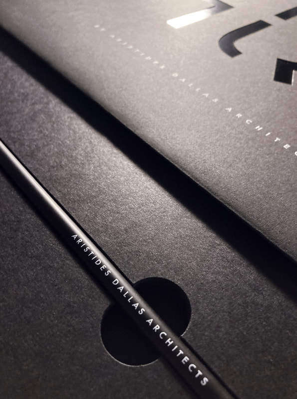
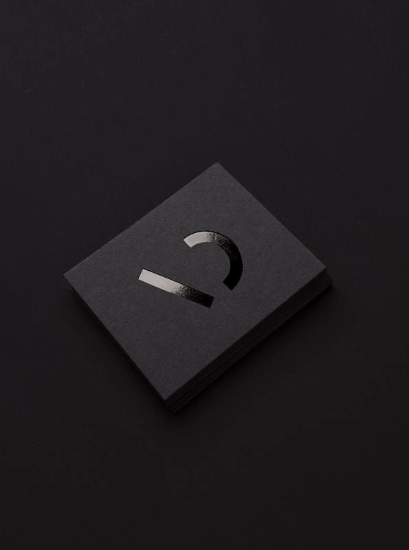
Aristides Dallas Architects is an award-winning architecture and design studio based in Athens, Greece. The catalyst for their rebranding was the design of a font inspired by their minimalist geometric signature style. A box was created for prospective clients as a promotional tool which included a brochure of their work, a business card, and a pencil to sketch new ideas.
www.aristidesdallas.com |

|
|

|
|